Dashboard
Note
This article refers to the legacy FraudScore interface. See more details here.
The Dashboard is a general overview report that visualizes all processed clicks for a selected period of time. You get a distribution timeline that shows processed clicks divided by thee categories: good (approved), detected and fraud (rejected).
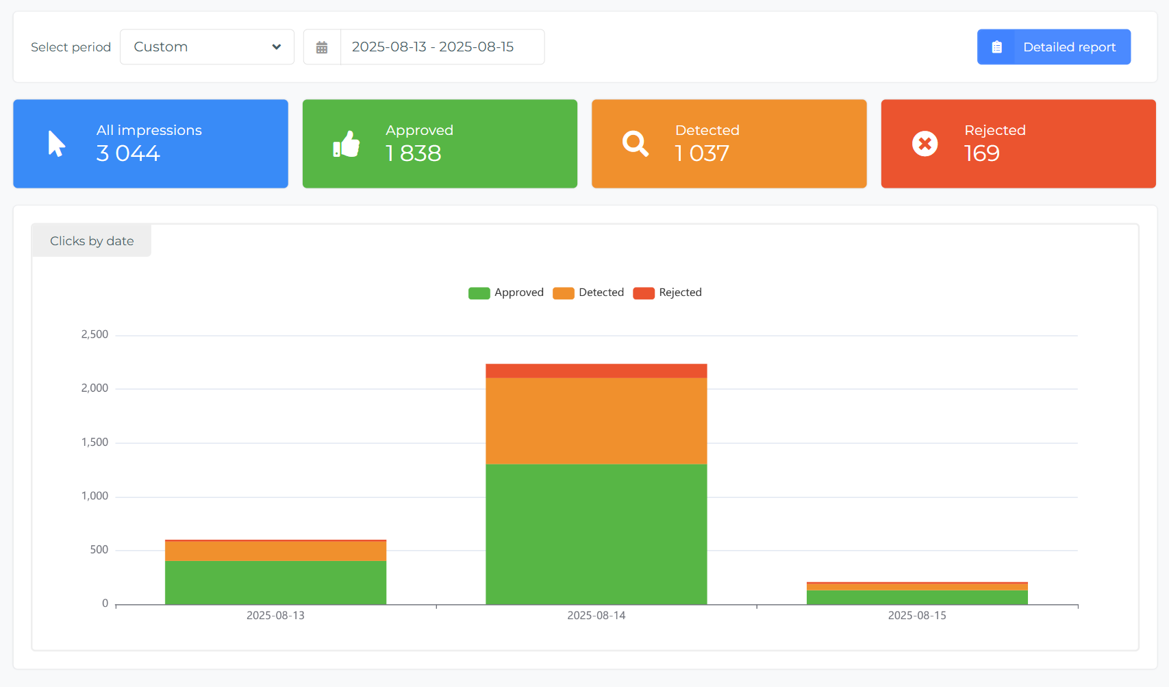
It means that green is for "no fraud" - good traffic, orange is for traffic with detected bad impressions, and red is for definite "fraud".
Why there is a Detected category? RT allows you to set filters for impression fraud detection, and find the right settings for your impression campaigns' verification. You can play with ClickSpam settings in FraudScore without rejecting real traffic, and see the result in the Detected category. Once the right settings are found — they can be applied to be used in real time.
Below the charts you get a total overview for a number of processed traffic and a pie chart that shows the distribution of good and bad events.
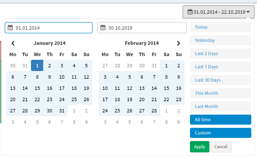
Always start with setting the time-frame for the report. Go to the "Period set" filter at the top right:
feb 27, 2026